
Since I started working with and learning about Web3, I became a curious user of any product I found. Therefore, now I want to talk to you about 5 aspects of ux in web3 to improve.
The lack of a good user experience struck me, and I found it similar to what Web2 went through before it became the Internet we know today. Web3 comes with really good technical advances and social foundations, such as decentralization, ownership and control of our own data. However, we can see how difficult it is for some users to navigate and understand these products.
Taking into account that Web3 still has a long way to go, it is essential to start this journey by mentioning some issues that UXers should pay special attention to.
What are the 5 aspects of UX that Web3 could improve?
1. Dev-centered content
The first UX aspect that web3 needs to improve is the technical acronyms and strings of alphanumeric information that are very common. This can be very difficult for a normal human being to read and understand. CeFi, DeFi, ERC-20, Smart Contracts, custodial, non-custodial and gas are some of the most popular terms. If you aren’t an expert user or a developer, these terms will most likely confuse and disorient you.
In this early stage, most product decisions are made by experts or developers, due they have spent more time working on it, defining and creating the technical foundations of Web3. But, the complexity this technology introduces appears hard to hide and presents many challenges to users.
We will need to add tooltips, explanatory text, guides or even a glossary with friendly information (see this glossary that helped me a lot on this journey). We need to know which technical jargon to use, when to provide the right information, and what our users truly understand. This knowledge will allow us to define content and communicate with confidence.
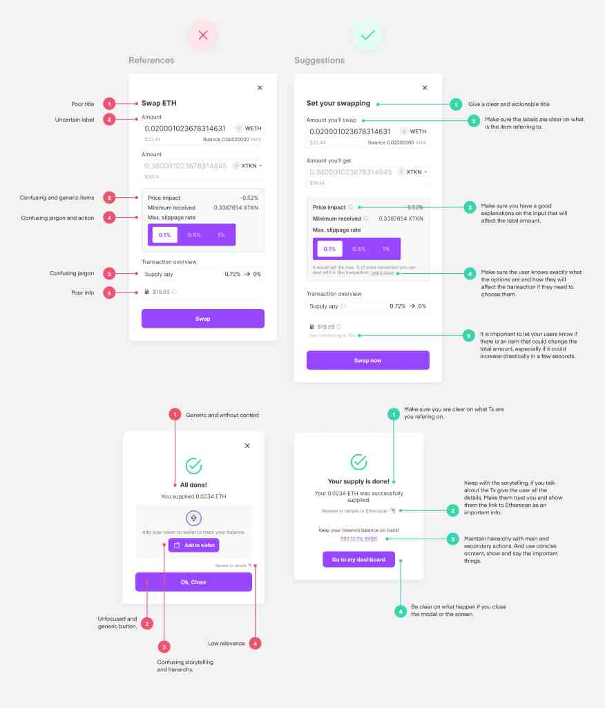
This is a reference of how you could improve a dApp transaction or message so it is easier to understand.
2. Asynchronous experience
Asynchronous experience is another UX aspect that web3 needs to improve. A single transaction requires multiple confirmations, as well as several pending messages to accept, and can occur on two different platforms (on your wallet and on the Defi App) within minutes of each other.
In most cases, the platforms do not provide all the information that the user needs to calculate, verify and accept the transaction. So the users must also check several sources or platforms simultaneously, such as the gas rate (fee), their token’s market performance (Token = any digital asset, cryptocurrency or NFT), the reliability of the address you are interacting with and so on. Also, most of this information is changing every few seconds.
We can provide links to the correct sources while being clear that we are redirecting them to an external tool.
Also, we can provide the exact data they need in one place, as well as giving instant feedback to guide the user in this uncertain and asynchronous environment.
Users accustomed to Web 2.0 transactions find it unusual for a payment to be canceled or not realize it has been made. We must reduce the overwhelming feeling of Web3 transactions.
My last thought on this is about mobile usability, as these actions and queries happen across multiple apps, along with website changes, and the information we consult is usually complicated and full of data. It’s a big challenge to think in mobile-first solutions.
How you could enhance that awkward moment where the users need to interact with their wallet. But the dApp never told them to do it.
3. Response times for blockchain queries are slow
This is one of the aspects of UX that the design in Web3 most needs to improve. Web2 users know that a 3 second wait for a system response is a long time. So, we need to figure out how to handle waiting time on Web3.
We must consider that reading data already written and confirmed in the chain might be fast. But writing data could be very slow. So, if someone expects to complete a transaction and then read it immediately, that user will face disappointment.
Depending on several factors (and the chain, not all of them perform the same way), the time frame can be from seconds to minutes or hours.
When pushing a transaction to the blockchain, it does everything a traditional database does. However, carrying more operations, including verifying signatures and validating tx with a consensus method, slows it down and adds more time before processing a transaction.
We need to be creative on how the users perceive the time. We need to be really clear about their actions status (ie. started, processing, finished), counters and loadings are a good tool to explain whatever the system is doing and how long it could take. Keep them on track!

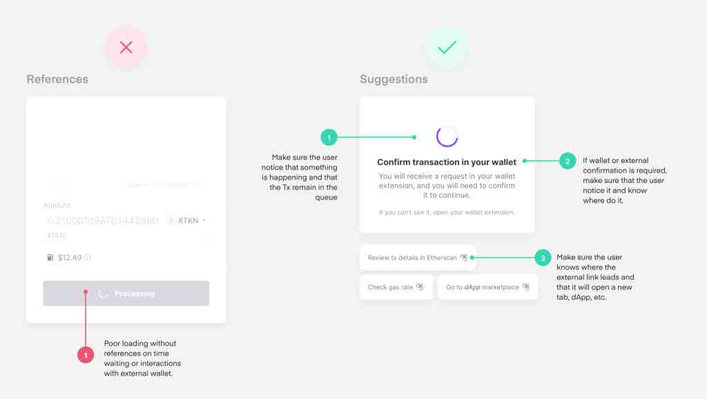
Here is an example of how you could enhance a dApp that needs to tell the user what is happening during a long or difficult transaction process.
4. New users mindsets are unknown
There is no doubt that Web3 brings with it major paradigm shifts, which will bring changes in the way users interact with it.
Decentralization will enhance the participation of the community in the development of this technology. Taking the ownership of our own information will make us more aware of how and where to use it. And force us to take full responsibility for keeping it safe.
Knowing that Web3 is still in its discovery phase, no one knows what they want or how they want it. The market price hasn’t even stabilized! It changes constantly at a pace hard to track, causing a feeling of chaos and stress. Will people adapt to this, or will this technology adapt to its new users mindsets?
To improve the UX aspect that Web3, It is necessary to keep our users close to us, to get to know them and to be aware of their needs and expectations, even if they don’t know it yet. Including user research, usability tests, metrics and other research methods that suit us, it will help us discover step-by-step the new mindsets and behaviors on which Web3 will be based.
There are plenty of active users who love to share information, whether openly or anonymously, on Twitter and Discord. There are even some Web3 projects for this; for example, there is a nice tool to obtain user insight, called Early Ones, that offers feedback and opinions from users that already are consuming Web3 apps in its early stages. We just need to look around, find our target participants and do our research.
5. Lack of education to the newbie web3 user
The last aspect of UX in Web3 needs to improve is the lack of education of the novice user. Newcomers can feel overwhelmed and disoriented when landing on a Web3 product for the first time. This happens especially on the first few screens of the product, which show all the information, features and options at once. There are no instructions and the system expects the user to figure out its usage independently.
The users must pay attention and be aware of all their interactions. There is no going back in blockchain matters, here is no customer support to solve the mistakes. If you don’t know what you’re doing, you could lose your tokens, keys, or other assets forever. And keep in mind that nothing on Web3 is for free.
Thus, a newbie faces a high barrier to entry and is prone to mistakes when it comes to niche knowledge. Is the UXer that should prevent any kind of undesirable mistakes where possible.
It is clear that the blockchain technology itself is a complex theory and challenges the user to be informed. But, it takes a lot of learning to fully understand it, and it shouldn’t be this hard for newbies. We need to educate, motivate and guide them.
To engage new users smoothly and faster in this world, we need to devote resources and efforts to educate them and provide friendly and digestible information.
Detailed manuals are not necessary. But the use of FAQs, help docs and walkthroughs could be good options, as well as paying special attention to our onboarding flows.
Also, we can add goals for users to achieve as they progress from newbies to advanced users. Therefore, this learning process can be simplified and more gradual.

Here are some ideas on how to improve the education intention on some platforms. Usually, you see this empty dashboard when you first interact with dApps, but none of them actively guide, motivate, or educate the users.
Conclusion
This has been just a glimpse of some of the aspects UX that web3 needs to change. But, I know there are a lot of other aspects that we could improve to make our new users’ lives much easier.
Good UX practices haven’t yet emerged and we have many challenges to overcome. The expectation and the high bar that Web2’s users left us, will turn these challenges into a real statement as something to motivate us to improve ourselves.
We are at a time when we need to use the best of web2’s design and mix it up with the best UX solutions that this new era will bring. Based, for sure, on new users.
We are always looking for Web3 talent !
Mighty Block is one of the partners of Forte, a platform to enable game publishers to easily integrate blockchain technologies into their games. We believe blockchain will enable new economic and creative opportunities for gamers around the world and have assembled a team of proven veterans from across the industry (Kabam, Unity, GarageGames, ngmoco, Twitch, Disney), as well as a $100M developer fund & $725M funding, to help make it happen. That’s where you come into play.
Feel free to browse all our current open job opportunities in the following link 👇